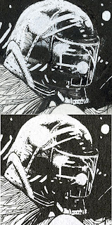
Hm. When I initially came up with the idea for a website about British comic art I toyed with the idea of taking various artists work and comparing how they drew various elements, like trees, rocks, folds in clothing etc. Having once been interested in pursuing comics as a career I'd often poured over my favourite artists work to see how they constructed and rendered objects (which is why I find original art so interesting to view). I guess that's how a lot of people start: they copy another artists style until eventually they develop their own way of drawing things. My own drawing style is mainly based on a Moebius illustration I saw in a Metal Hurlant feature I read in NME back in the early 80's. Anyway, I was trawling the Net a while back and came across this bloke's blog and he had a similar idea. He's taken a couple of pieces of art and examined the mark-making within the page.
See, no idea is truly original.
Here's the original art, a John Hickleton page from 2000AD:
And a couple of examples of the mark-making process:
Any-hoo. If you're interested have a dekko at his blog:
John Hickleton.
Mike Dorey.
A page from 2000AD. Not the original art, unfortunately.


No comments:
Post a Comment